
The state oil company’s first public face

To help with the practical work, Marit Hielm Falck was taken on as a secretary in December 1972. A commercial-college graduate, she had been out of the labour market for several years and is famed for bringing in an empty cigar box which became the company’s first cashbox. “We were cautious to start with,” she has said.[REMOVE]Fotnote: Norwegian Oil and Gas, 22 December 2019.
The company had no earnings of its own to begin with, but drew on its share capital and appropriations from the Storting (parliament). So a restrictive line was taken both on salaries for the first employees and in other areas. Johnsen was not happy when Oslo tabloid VG wrote that he received NOK 180 000 per year – almost twice the amount other people in highly responsible positions at the company had been offered.[REMOVE]Fotnote: VG, 28 April 1973.
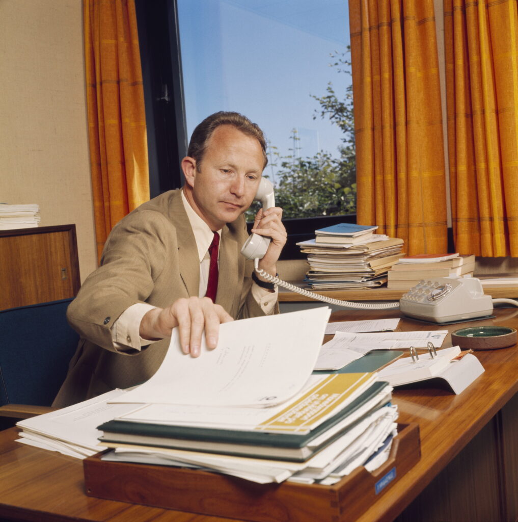
The CEO was initially the company’s public face. At the board meeting on 4 January 1973, he reported than 10 or so newspapers had asked for interviews. The directors requested that he accommodate these requests. Since it was necessary for the company to open up to the general public, appointing an information manager to handle this job became a priority. Journalist Arne H Halvorsen from local daily Stavanger Aftenblad became the first person to occupy this post.[REMOVE]Fotnote: Johnsen, Arve, Utfordringen: Statoil år (1988): 8.
Company name
Johnsen had ideas about how the company should be presented to the outside world. At the board meeting of 29 March 1973, he proposed trying to establish a shorter name – Statoil. This was because writing “Den norske stats oljeselskap a.s” in full each time proved burdensome, given the many documents generated during negotiations with the Phillips group over Norpipe. Nor was the name particularly suitable for spoken use – particularly in English.
Many years of experience from international business with Hydro had taught Johnsen the significance of a brief company name which could be used worldwide. A logo was also required to identify the company externally. Both the name and the logo could also be significant for team spirit and a sense of belonging within the company, Johnsen maintained.[REMOVE]Fotnote: Ibid.: 51.
The abbreviated title was not approved without discussion in the board. Deputy chair Vidkunn Hveding, a member of the Conservative Party, devoted much time to finding alternatives. He did not like “Stat”, and maintained at “Nor” would be more suitable. Unfortunately, however, Noroil had already been appropriated by a Norwegian journal. So Statoil it became.
This name was first revealed on 28 April 1973, when a Norwegian delegation was on its way to the Houston oil show. Johnsen and colleague Arne Lervik were on the same flight to interview American applicants for jobs as geologists and geophysicists in Statoil and for management posts in the newly established Norpipe pipeline company.
Johnsen gave an impromptu press briefing on board to Arne H Halvorsen (then still with Stavanger Aftenblad) and fellow journalists Ole Jacob Kvinnsland and Håkon Lavik. The plane made an intermediate stop at Montreal in Canada, allowing the trio to call home with the news of the abbreviated name.[REMOVE]Fotnote: Håkon Lavik, published on Facebook, 24 February 2020. The story appeared in Stavanger Aftenblad under the headline “Over to Statoil” on 30 April 1973.
Visual identity
Statoil needed to establish a visual identity with a logo or emblem. Several advertising agencies were hired to come up with proposals.
The final choice fell on a design by Magne Nedregård.[REMOVE]Fotnote: Håkon Lavik, published on Facebook, 24 November 2019. Most people associated this solution with a stylised oil droplet. But it could be understood in another way – as two flames symbolising energy from two energy sources, oil and gas. The droplet could also represent a cross-section of the planet with oil resources in the middle and a well drilled from the surface. Even more fancifully, the outer ring could be perceived as the North Sea, the inner as oil deposits and the curves around the “well” as waves. Or it could be viewed as two droplets – oil and seawater, and as the “o” in oil.[REMOVE]Fotnote: Johnsen, Arve, Utfordringen: Statoil år (1988): 52.
The chosen logo was to be incorporated in the company’s visual identity, the colour palette for printed materials and so forth. Ståle Bakke from the Ottesen Bates agency played a crucial role here. Turquoise was the option finally selected.[REMOVE]Fotnote: Håkon Lavik, published on Facebook, 24 November 2019.
This colour did not function so well on signs which were to be read at a distance, and was therefore unsuitable for the service station chain established later. That was when the orange droplet on a blue background appeared.
arrow_backThe “Statoil article”A short-lived boardarrow_forward